

Inclusive website Design
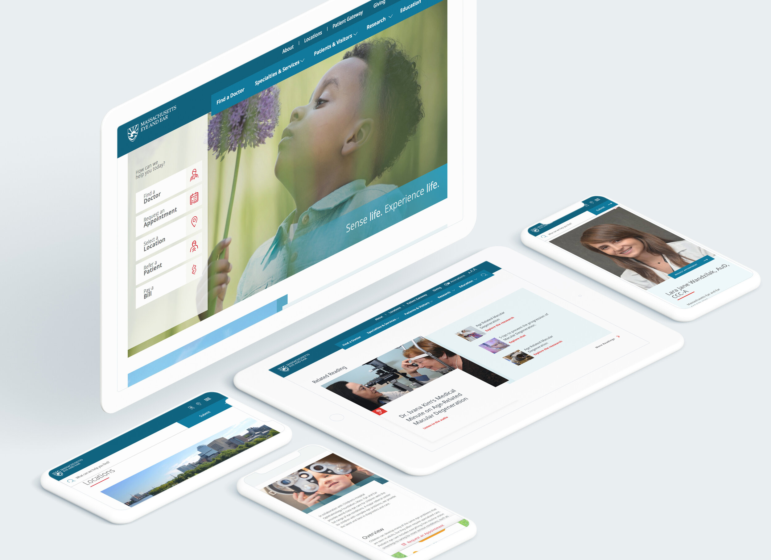
Mass Eye and Ear is proud of its unmatched expertise and deep specialization. We partnered with them to create a new, patient-centric website that was equal to the task.
Inclusive website Design
Mass Eye and Ear is proud of its unmatched expertise and deep specialization. We partnered with them to create a new, patient-centric website that was equal to the task.
“THE MASSACHUSETTS EYE AND EAR WEBSITE MEETS the strictest accessibility standards of any site in healthcare - OR ANYWHERE ELSE".
– Frederick M. Jones, Accessibility Institute of America
Mass Eye and Ear has an unmatched reputation and mission defined as ‘A promise that every child will see and hear throughout their lifetime.” During our discovery we were surprised to learn that the site we were replacing was not friendly for people with vision impairment. More than half the visitors told us they were craving better accessibility.
Further, the former site lacked the clean, simple design and functionality one would expect from a premier institution.
So we embarked on a digital strategy we dubbed “Inclusive Design”. The intent would be to make the site easily useful and enjoyable for as many individuals as possible.

A+ for Accessibility
The site is now the defacto standard for website accessibility, thanks to a rigorous design process.
A+ for Accessibility
The site is now the defacto standard for website accessibility, thanks to a rigorous design process.
It’s not a simple task to make a site that is truly optimized for vision impaired people. We became expert at designing colors that will work for color blind people. We learned how code pages and tag photos in a specific manner so that screen reader would accurately capture the essence of the page.
Early mood-boards for color and iconography.
The thumb test
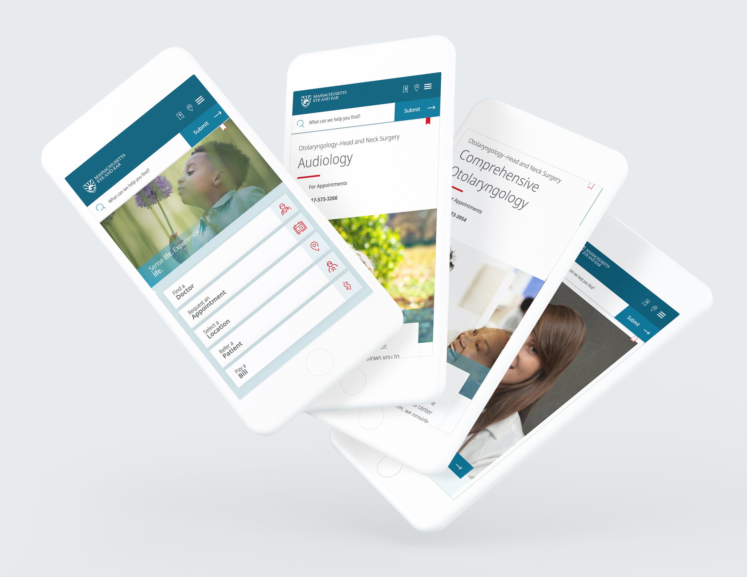
As in all our projects, a mobile first approach means the site is a greatly simplified experience. We have a simple test at White Rhino to determine if the mobile version is up to par: can a user access all important interactions with just one thumb while holding the phone? Yes!


